
I got accepted to a video game themed art show with a deadline of a week or so. So I was short on time and needed to work really quickly.
I go through my list of favorite games and then go over a list of games I like that other people actually remember. My own taste in games tend to run towards the really old or really odd (Evil Genius, Thief the Metal Age, Viscera Clean Up Detail, Katamari Damacy etc.)
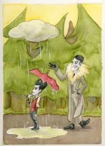
After a bit of kicking around I finally decide to try to do a piece based on my personal favorite time sink, Don’t Starve. Partially because I really like the style of the game, and partially because there’s a good chance that people might actually recognize that one.(My masterpiece based on a sci-fi mopping simulator will have to wait for another occasion. )

Since I started playing Don’t Starve‘s latest update, the one thing that has stuck with me is the rain. The irritating never ending buckets of rain. Also I generally love umbrellas and excuses to draw them. With that in mind, I start off with a rough concept sketch in Mischief. I already knew what sort of dimensions this piece needed to be and the look I was aiming for.
Sometimes I really don’t have an idea and will throw stuff around until something sticks. This was thankfully not one of those occasions.
The initial concept sketch I had once on screen looked too much like a My Neighbor Totoro reference.While that’s hilarious, it’s not really the intent of this piece so I grumble and try to think of a fix.
I end up doing what I usually in these situations: bounce ideas off of someone on my chat list who happened to be up at that odd hour. She suggested a simple tweak that pretty instantly fixed my problem and made me feel dumb.
With the rough ironed out I start polishing and fleshing out the rest of the piece. I do this in Mischief and import it into Photoshop to size and print properly to fit onto my watercolor block (9×12). I want to keep the focus on the these two derps so I keep everything else that isn’t a derp very simple. Just some trees and such to help imply the setting without going crazy.
Regardless of all the biomes in the Don’t Starve setting I always tend to think of the game as a forest full of evergreens and hatred.

Once I get into Photoshop I see the picture boundaries I had eyeballed in Mischief are a tad short so I expand the piece upwards and realize I have room to stretch the trees and this prevents the cloud from over lapping with the top of the trees. (Avoiding things meeting at edges is a basic rule of composition in design and illustration that they teach you in art school sometime after they make you assemble a color wheel and sometime before they break your soul.)
When the lines are printed I scribble on the back of the sheet with a soft lead pencil, coating the paper with lead. I then tape this down onto my watercolor block with artist tape to keep the piece from moving and trace over the printed lines. There are transfer papers to do this. But that costs a lot more than one soft lead pencil every six months.


This transfer process, despite its genius in simplicity, tends to leave vague impressions and lines rather than a perfect copy. This is still a lot easier and cleaner process wise than working from scratch. I spend the next half hour refining and cleaning up my lines. I use the printed version as a guide to make sure I’m not missing or messing up anything.

The final step of the line art once I get all the lines polished and in the right places is inking. Not shown is my rather large collection of pens. I tend to use Sakura microns and Copic multiliners of various sizes. In this case I think the really delicate lines of Maxwell’s fur collar are done with a .01 size pen while the rest is a .03 or higher. (I discovered half my pens are dying so my selection isn’t that great at the moment.) Once again I want to keep focus on the two main figures so they get the most detail and I keep most everything else pretty clean and simple.
This piece is supposed to be unmatted for the show so I want to be careful about the edges of this piece, I tape up the borders to try to protect the border. I start laying out some flat colors for the background. Sadly despite my tape some paint bled along the edge (not documented as I was too busy flailing). I lift as much of the color as I can to make the bleed less obvious. I then add two layers of tape and swear through grit teeth.

I add a bit of blues and purples on the tree trunks for shadows. Add a bit of definition to the trees for shape. Once I’m sure all this is dry I start adding a flat layer of color to Wilson (our poor little butt-monkey with an umbrella). He’s a darker/ bolder color than the rest of the piece. so I’m going to have to work on him a lot to make him pop.
 I add more color to Wilson and start cracking at the rest of the piece. Maxwell, the cigar smoking ass, is usually shown wearing a light brown/ warm gray ensemble. After a bit of debate on his concept art I vote to give him gray-ish hair. On a whole he’s very monochromatic, so I’m hoping to leave him lighter in value to stand out from the background.
Now that he’s started, I let that dry before I go smartening him up. It’s time for me to start working on the part that’s got me really concerned: the raindrops and puddle.
The puddle turns out to be surprisingly simple, just some hazy colors from the trees and sky, to act like a reflection. The raindrops however…I haven’t painted water like this in watercolor before and if I mess up the raindrops, there really isn’t an easy way for me to fix that or work around it. I try at first drawing in the raindrops with a white pencil or an artist crayon, but it’s pretty obvious the end results aren’t vivid or sharp enough.
 So I bite my nails and pray to the art gods and start thinning down some white gouache. (Gouache is a paint that acts a lot like water color, it’s water soluble, the main difference is that straight out of the tube it’s got a chalky opacity. Which is perfect for this sort of task.) I grab a fine tipped brush and start manually painting them in very delicately.
I breathe a sigh of relief as it looks like I am almost finished with this piece…. Now all that’s left are a few finishing touches.
I use a white pencil to add pinstripes on Maxwell’s suit. I sharpen up the cloud and the highlights and darks of the puddle a bit. And I’m not too thrilled with the ground; it looks rather flat and needs some texture to it. Using my watercolor pencils I add some hatching to the ground, blending it a bit with water so it’s not too distracting. Then I hatch in some more shadows around Max for good measure.
 Wait for all that to dry, and then carefully remove tape border and cry at the sloopy edges. Try desperately to paint over the edge bleeds with white gouache, and only manage to make it less noticeable. I then quickly get my pallate knife and gut this off the block to stop me from messing with this anymore. Then this gets signed, and placed somewhere safe out of the line of water, cats, and anything else that would destroy this and make Lissa sad.
Afterwards I flop over on my bed and pass out for a few hours.
This painting is available for sale either as a print on Redbubble OR the original itself. If you are interested in the original 9×12 painting you can e-mail me at lissaquon(a)gmail(dot)com.

3 thoughts on ““Say Pal…You Don’t Look So Good…” a step by step technique ramble”